How About Adding Some BLING To Your Brand?
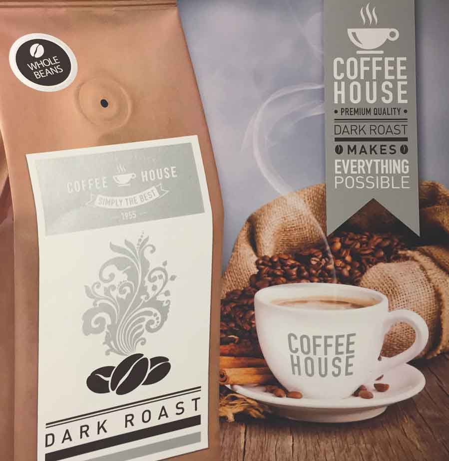
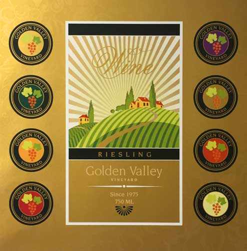
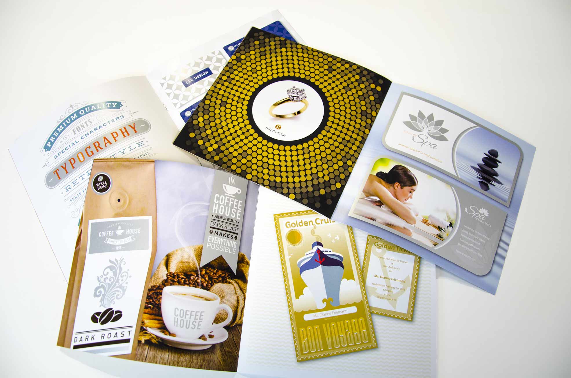
We’re proud to announce the addition of digital silver and gold metallic dry inks to our arsenal of printing solutions.
Stand out and add a little sparkle dimension to your marketing and promotional pieces. After all, a little BLING is always noticed and never forgotten.
Just imagine how your logo would look using silver or gold metallic dry ink in the design? How about enhancing the look of photos with metallic image overlays? What about greeting cards, invitations, and direct mail pieces where you can highlight headlines and variable content with some BLING? Incorporating metallic dry ink in your design is easy, we’ve got some tips that will help you get you started:

For Adobe InDesign® Files:
- Set-up a new layer and name it silver or gold. This will be your metallic layer.
- Set-up your new color. Note, the instructions for silver & gold color set-up are slightly different than in the video
- Add your silver or gold color. Window > Color > Swatches. From the hamburger drop down menu, select new color swatch. In the Color Mode drop down, select Pantone Metallic Coated, choose either 871C for gold or 877C for silver, press ok. Double click on your new color in the Swatches Panel and change the name to either Silver or Gold, change the Mode to CMYK, and make sure Spot Color is checked.
- When renaming your colors, it’s extremely important that you use capital letters for S & G. The name should either be Silver or Gold…no other letters or words. Also use either silver or gold in your design.
- Draw a shape or select text that will have the metallic ink applied. Make sure all elements to print with BLING are on the metallic layer.
- Fill your shape with the new spot metallic color swatch.
- If the metallic dry ink element is sitting on top of a photo or field of color and you want that background to show through (and potentially dull the appearance of your metallic ink), select Window > Output > Attributes > Overprint Fill, Overprint Stroke, or both.
- After you set overprinting options, you should use the Overprint Preview mode (View > Overprint Preview) to see an approximation of how the overprinting colors will print.
- When different colored objects are stacked, the top color knocks out the area underneath when printed. So your metallic ink over your background will be maintained, no action needed.
For Adobe Illustrator® Files:
- Set-up your metallic layer as you did in InDesign.
- Set-up your metallic color. Note the instructions here are slightly different than in the video.
- Select Window > Swatches > Color Libraries > Color Books > Pantone Metallic Coated. When the window comes up, search on 871 (for gold) or 877 (for silver). Add either color to your Swatches Panel. Once added, double click on the color and change the mode from Book Color to CMYK, change the name from Pantone to either Silver or Gold. This will remain a Spot Color.
- When renaming your colors, it’s extremely important that you use capital letters for S & G. The name should either be Silver or Gold…no other letters or words. Also, use either silver or gold in your design.
- If the metallic dry ink element is sitting on top of a field of color and you want that background to show through (and potentially dull the appearance of your metallic ink), select Window > Attributes > Overprint Fill, Overprint Stroke, or both.
- After you set overprinting options, you should use the Overprint Preview mode (View > Overprint Preview) to see an approximation of how the overprinting colors will print.
- When different colored objects are stacked, the top color knocks out the area underneath when printed. So your metallic ink over your background will be maintained, no action needed.

A Couple Of Other Things To Consider:
-
Be careful with competing colors. Colors too close to silver or gold optically reduce the BLING look.
-
Metallic dry ink elements placed on top of, or next to, light colors will have the most awesome effect.
-
Your printer can do multi-passes to give the appearance of raising an object off a page. Multi-passes on fine lines and little text will produce minimal effects. We can recommend the right course of action based on your design.
-
Smooth texture, matte, or dull coated papers tend to provide more impact and a better BLING result.
- ALWAYS name your SPOT color with a capital letter. Silver or Gold. This naming convention should be consistent in all your files. This is extremely important to ensure that the metallic dry ink will be applied correctly.
Of course, we’re here to help and collaborate with you on your design. Our #1 job is to make your job easier. You can RELAX…we got this.

Stop by next month to read Part 2 of our three part series to help you with using a little bling in your marketing materials.
Visit our DIGITAL & OFFSET Services page to learn more about what we produce and what our clients say about us!
Want to see what silver & gold metallic dry inks look like on paper? Get your FREE Print To Impress Sample Collection here.


